The Rise of Performative Productivity
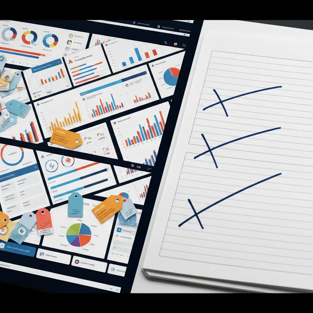
It usually starts on a Sunday afternoon. You decide it is finally time to get your life together. You open a fresh workspace in a modern productivity app, armed with a vision of absolute control. You build relational databases. You assign color-coded tags to every conceivable category of your life. You add custom icons, progress bars, and interconnected dashboards that look like they belong in the control room of a space shuttle.
For a few hours, you feel unstoppable. You have engineered the perfect system. But fast forward to Thursday morning. You are running late, a client is demanding an immediate revision, and you need to quickly jot down a critical task. You open your beautiful system, and suddenly, the friction hits you. To add a simple task, you have to assign it a priority level, link it to a parent project, select a context tag, and estimate the time it will take. Instead of doing all that, you scribble the task on a stray post-it note. By Friday, the system is abandoned, joining a graveyard of past organizational attempts.
You have fallen victim to the Dashboard Illusion. This is the psychological trap of confusing the aesthetic organization of work with the actual execution of work. We build beautiful, intricate systems because building them delivers a massive hit of dopamine. It feels productive. It looks productive. But in reality, it is a sophisticated form of procrastination masquerading as preparation.

The Psychology of the Dashboard Illusion
To understand why beautiful systems fail, we have to look at how the brain processes cognitive load. Every time you interact with a system, you spend cognitive capital. When your system is highly visual and densely categorized, it demands a heavy toll just to maintain its baseline state.
There is a distinct difference between the feeling of control and the reality of output. Complex dashboards provide the feeling of control. Seeing all your tasks neatly arranged by color and priority creates a soothing visual symmetry. However, high-performing professionals do not need their tasks to look pretty; they need them to be visible, actionable, and frictionless.
When you prioritize aesthetics and hyper-categorization, you inevitably introduce three silent killers into your daily routine:
1. The Upkeep Burden
Beautiful systems are fragile. They require constant, meticulous data entry to remain beautiful. If you miss a day of tagging, sorting, and linking, the database becomes messy. Because your brain associates the system’s value with its visual perfection, a messy dashboard triggers anxiety. Instead of doing the work, you spend thirty minutes ‘cleaning up’ your task manager. You are no longer managing your work; you are managing your system.
2. The Metadata Bottleneck
Metadata is data about data—the due dates, priority flags, context labels, and energy estimates you attach to a task. While a small amount of metadata is useful, complex systems demand too much of it. If logging a task takes more than three seconds, your brain will subconsciously avoid logging it. You will start keeping things in your head, which leads to dropped balls and spiked cortisol levels.
3. The False Sense of Velocity
Moving a beautifully formatted card from a ‘Doing’ column to a ‘Done’ column feels fantastic. It feels so good, in fact, that we often break down tasks into microscopic, meaningless sub-tasks just to experience the thrill of checking them off. This creates a false sense of velocity. You spent eight hours interacting with your system, but you moved the needle on zero actual projects.
The Case for ‘Ugly’ Workflows
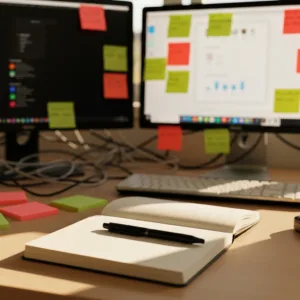
If you study the workflows of prolific writers, top-tier developers, and highly effective executives, you will notice a recurring theme: their systems are shockingly ugly. They use plain text files. They use native, unformatted note apps. They use legal pads with chaotic handwriting.
They do not use these primitive tools because they are ignorant of modern software. They use them because they have discovered a fundamental truth of productivity: the best workflow is the one that gets out of your way. An ugly workflow prioritizes function over form. It is highly resilient, requires zero maintenance, and possesses virtually no friction. It does not ask you to categorize your thoughts; it only asks you to record them and act on them.
An ugly workflow acknowledges that the actual work happens in the messy, unstructured reality of the human mind, not in the rigid columns of a Kanban board. By stripping away the visual noise, you force yourself to confront the work itself, rather than hiding behind the comfort of organizing it.
How to Engineer an Ugly Workflow
Transitioning from a highly aesthetic system to an ugly, high-output workflow requires a shift in mindset. You must stop viewing your productivity tools as a digital home, and start viewing them as a disposable workbench. Here is how to engineer a system optimized purely for execution.
1. Implement the Two-Second Capture Rule
The core metric of any productivity system is its capture speed. The gap between having a thought and securing it in a trusted place must be practically zero. Choose a tool that opens instantly and defaults to a blank text entry field. Strip away all mandatory fields. If you have an idea for a project, you should be able to type it and close the app in under two seconds. Worry about processing it later. Speed of capture prevents cognitive leakage.
2. Eradicate Mandatory Metadata
Audit your current task manager and ruthlessly delete your tags. You do not need a ‘High Priority’ tag; if it is high priority, put it at the top of the list. You do not need an ‘Energy Level’ tag; you know instinctively how hard a task is when you look at it. Keep only the absolute minimum structure required to prevent chaos. For most people, a simple chronological list or a basic ‘Today, This Week, Later’ division is more than enough.
3. Decouple the Archive from the Workbench
A common mistake is trying to do your daily execution in the same place you store your long-term reference material. Your archive—where you keep meeting notes, project blueprints, and financial records—can be highly structured and organized. But your workbench—where you manage your daily tasks—should be brutal, messy, and temporary.
Use a daily scratchpad. Every morning, open a plain text document or a physical notebook. Write down the three to five things you must accomplish today. Work exclusively from that scratchpad. Cross things out. Make messy notes in the margins. At the end of the day, delete the digital file or turn the page. The workbench resets daily. This eliminates the buildup of visual clutter and prevents the dread of staring at a massive, never-ending backlog.
4. The Exhaustion Stress-Test
The true test of a productivity workflow is not how well it operates on a quiet Sunday afternoon when you are highly caffeinated and deeply motivated. The true test is how it holds up on a Thursday afternoon when you are operating on four hours of sleep, your inbox is on fire, and you have exactly twelve minutes between meetings.
If your system requires high mental energy to navigate during those moments of crisis, it is a liability. Design your system for your worst, most exhausted day. If a sleep-deprived version of you can still use the system to capture a vital piece of information without friction, the system is robust.
Reclaiming Your Cognitive Capital
We are drawn to beautiful systems because the modern knowledge worker rarely produces tangible things. A carpenter can look at a finished table and feel the satisfaction of a hard day’s work. A knowledge worker often ends the day with nothing to show for it but a few sent emails and a tired mind. A beautiful, complex dashboard serves as a proxy for physical output. It is something we can look at to prove to ourselves that we are working hard.
But true leverage comes from abandoning the need for that performative comfort. When you stop caring about how your system looks, you free up massive amounts of cognitive capital to deploy against the actual work. You stop playing house, and you start building.
Embrace the plain text. Embrace the messy list. Let your output be beautiful, and let the system behind it be as ugly as necessary to get the job done.


Do you enjoy the content on Agenda Creativa?
Your contributions help me create new articles, share creative ideas, and keep this platform alive! If you like what I do and want to support my work, you can buy us a coffee.
Every cup of coffee means more than just a gesture – it's direct support for my passion to create inspiring and useful content. Thank you for being part of this journey!
☕ Buy me a coffee